
Grouping and identifying your students using assessment data
Feature 29 Mar 2023 5 minute readKey takeaways from our recent webinar on how to use PAT data to group your students by achievement, strengths, misconceptions, and gaps as well as how to support the next steps in their learning.
Daniel O’Loughlin, Project Director of ACER’s School Engagement program, presented practical guidance for reviewing PAT assessment results in our recent Grouping and identifying students using PAT data webinar.
The focus of the session was the bridge from the first step of the Progressive Achievement approach, using data to understand where students are in their learning, to the second step, informing teaching and learning.
In case you missed it, you can view the recording here or read the key takeaways below.
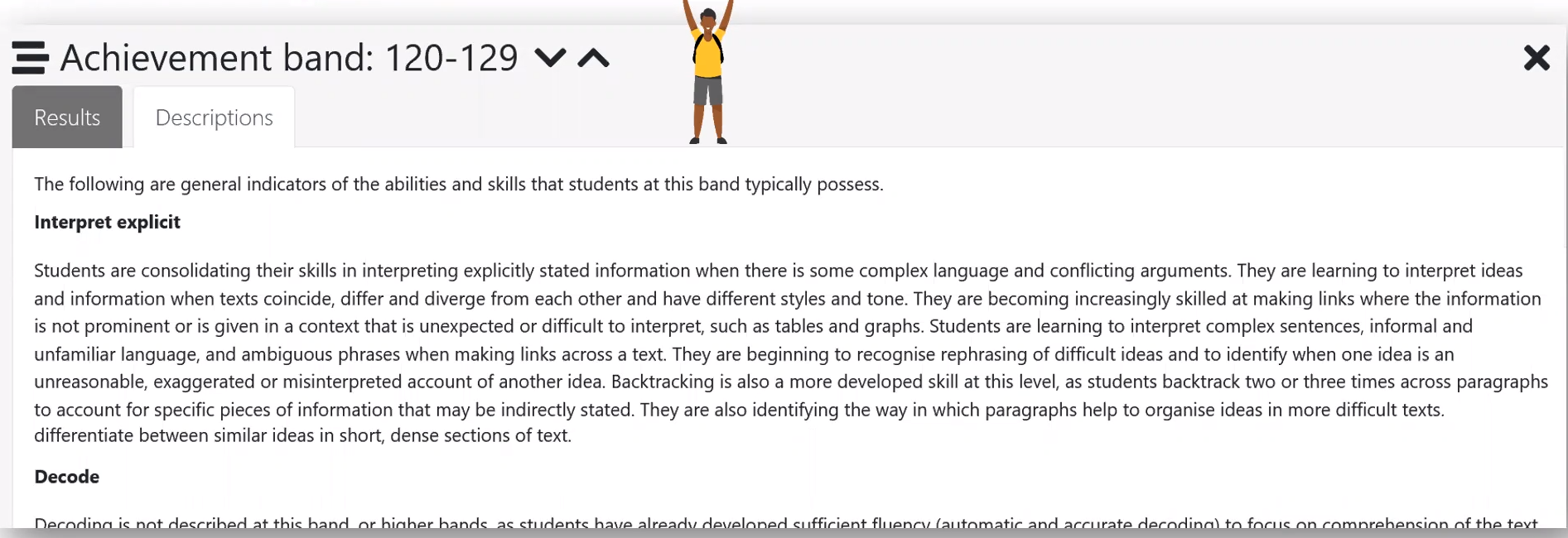
Using your scale scores and achievement bands
The PAT reporting suite uses scale scores and achievement bands – scale scores provide a numerical, quantitative measure, and achievement bands provide qualitative context to the score. Using scale scores and achievement bands together can support you to unpack the achievement of a group of students.
‘For example, for students with a scale score of 120-129 in PAT Reading,’ Mr O’Loughlin explained, ‘it’s likely that they are working around consolidating, building, developing or mastering some of the skills that are outlined in the achievement band description.’
Grouping your cohort by similar starting points (or achievement)
To gather a general idea about the achievement of students in a particular year level, you can review your student’s results against the norm comparison.
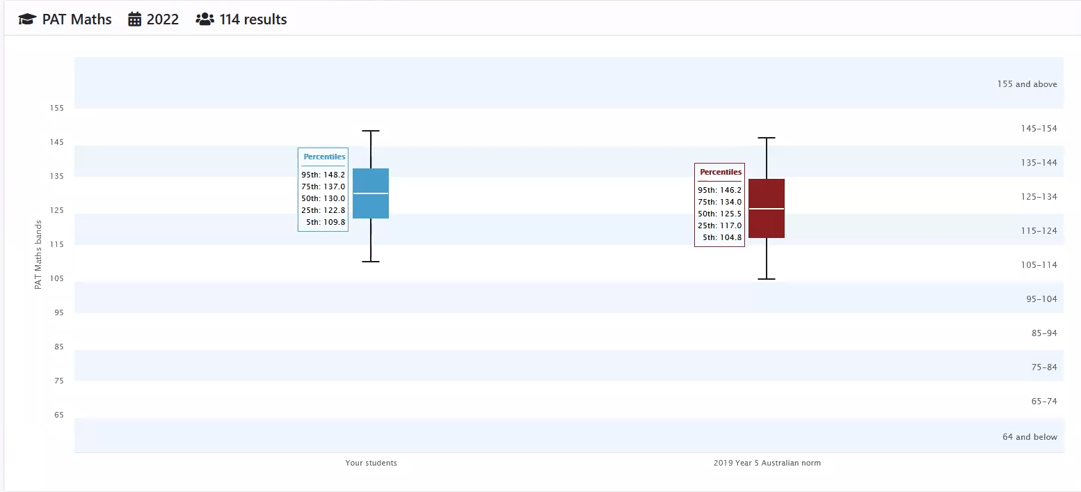
When viewing the 'norm comparison' chart in the PAT Data Explorer (above), Mr O’Loughlin described how you can see ‘most of my students are working between the 25th percentile, or a scale score of 122, up to a scale score of 137, or the 75th percentile.’
You can then see this visually represented in the 'completed tests' chart (below), with students appearing against the achievement bands.
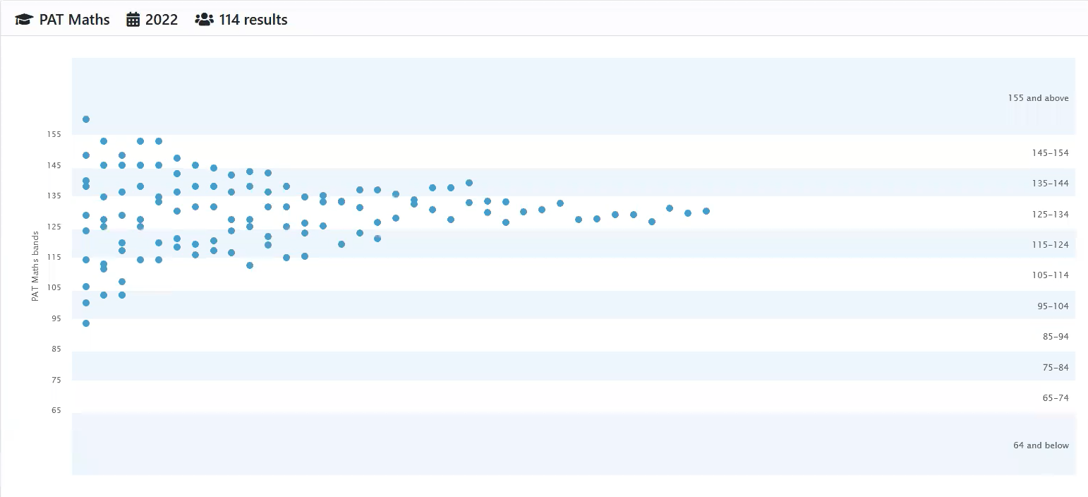
By finding out who these students are and reading the band descriptions, you can begin to group your cohort.
‘If we look at some of the students who have a scale score at around 134, they are at the very top of this band. I would be looking at the band above for information about where to extend them toward,’ Mr O'Loughlin said.
‘Similarly, when looking at the band below – have these students consolidated and mastered these skills? There might be a prerequisite for understanding a more sophisticated skill that we might be learning or unpacking soon.’
Group students by strengths, weaknesses, misconceptions and gaps
Next, you can drill down into the data by question, looking for patterns and outliers within your results.
In the PAT Linear reporting, you would begin with the Group Report; in the PAT Data Explorer, the Item Performance Report.
Using the Item Performance Report (below) as an example, you can look across your cohort, filtering for questions (known as items) by the percentage correct or incorrect.
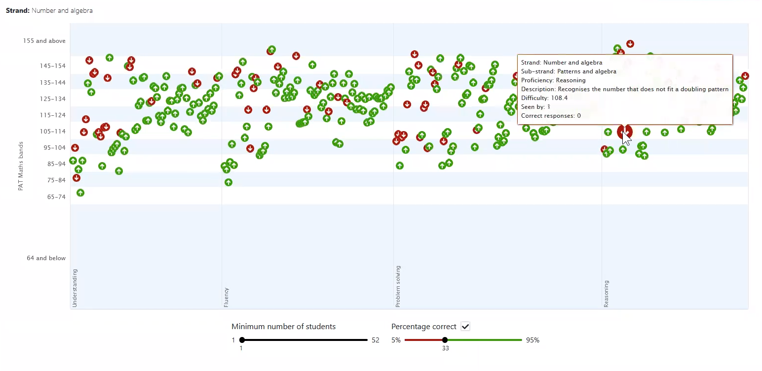
To support grouping your students, you can then investigate the item and see which students answered it correctly or incorrectly and what their scale score is, as displayed in the report below.
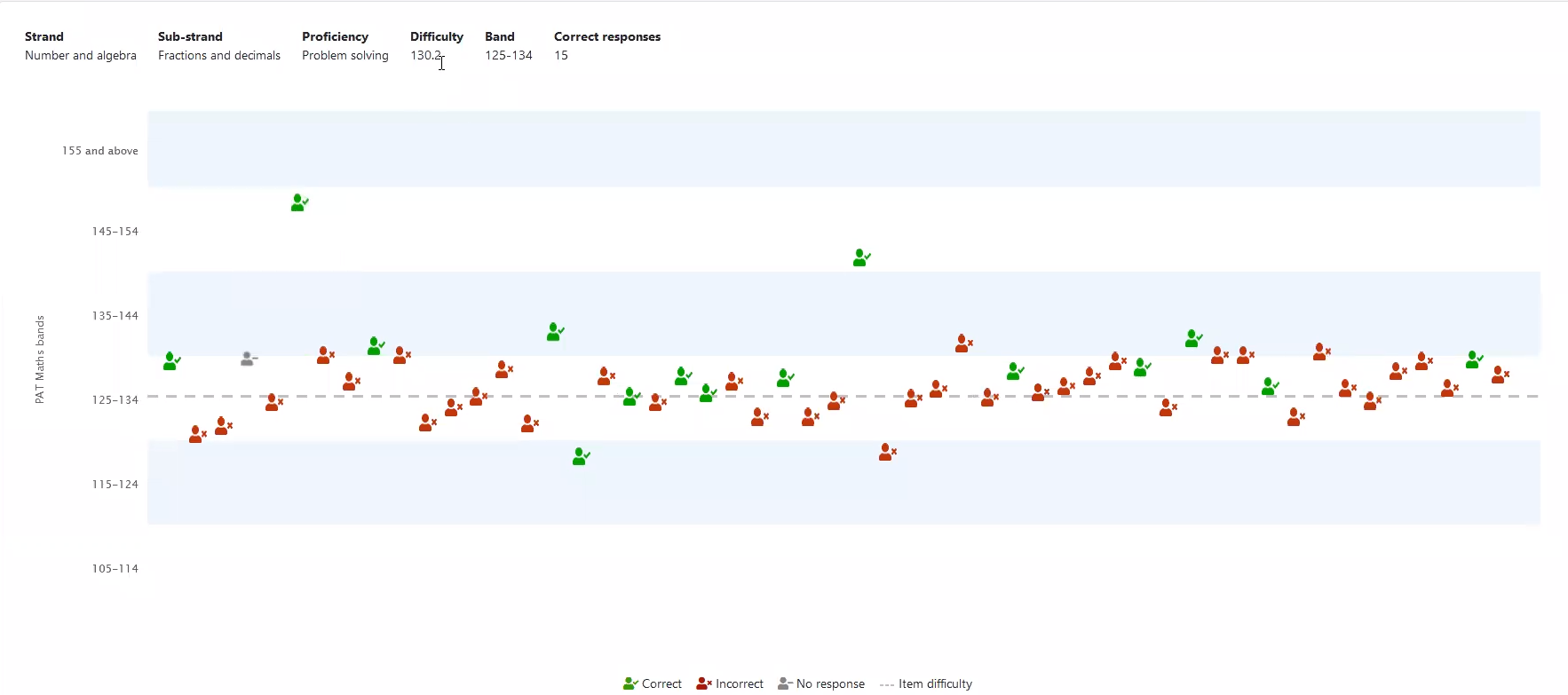
‘Typically, you’d expect students above the dotted line [indicating the question difficulty] to be able to answer the question correctly, and those students below to answer generally incorrectly.’ Mr O’Loughlin explained. ‘And where that doesn’t fit the pattern that will likely show a sign of a weakness or a strength.’
By then reviewing the answer patterns, and referring to the PAT Teaching Resources Centre, you can identify if there are misconceptions, as well as supporting activities for extending your students.
Learn more
If you would like to hear the full discussion, you can access this webinar in your school account, or by registering here.
If you have any queries, please reach out to the School Engagement team at school.engagement@acer.org.